Saturday, July 31, 2010

Beautifully Banal


Artist Christian Robert-Tissot. image from his online portfolio.

Monday, July 26, 2010

Mental as Anything

After recently having my first full-blown critique of my collection-in-progress I recieved one main piece of advice from all present- "Go Mental". Everything needs to be bigger, more intense, more ruined, more everything just more MENTAL. This is amazing to hear (as was pointed out to me, once I get into the real world I'll never hear those words again) but also an incredibly scary at the same time. People don't just go crazy with design because it's so hard to do well- there is a fine line between an insane mess of fashion and just a big old mess. Those who do manage to do it well are few and far between.

That said, if there's one time to try insanity it's now, so in that spirit have a look at The Books kooky film clip for Cold Freezin Night. The best part about this song is that the samples of kids voices saying these outrageous things came off "Talkboy" cassette tapes that the band found in second-hand stores. Talkboys are childrens tape recorders, letting them record whatever their heart desires, including sibling fights and death threats. For more background on the song (like how they got that hectic percussion in the background) and the rest of the album check out The Books daily blog.

the Books - A Cold Freezin' Night from Paul de Jong / Nick Zammuto on Vimeo.

Friday, July 23, 2010

Delinquent Children

An array of clashing checks, waistcoat jumpsuits and punk style t-shirts greet the visitor to A Child of the Jago, the conceptual retail brainchild of Joseph Corre (the man behind Agent Provocateur) and Simon "Barnzley" Armitage. They describe the label as "a child of the street. The destitute and illegitimate progeny of a hopelessly rundown environment". To be honest I didn't really get that feeling when I first entered the store, but perhaps it was something to do with the fact that it only sold menswear so I was wrong-footed from the start. In fact it wasn't until I was about to leave that a gentleman in suspenders, a top hat and a single leather driving glove recommended I visit the downstairs area.

What I found down there was a veritable Victorian dungeon of delights, complete with dim lighting and a slightly musty smell. My eyes slowly grew accustomed to the gloom, revealing a mad mix of antique furniture, clothing and other random objects with no discernable use.


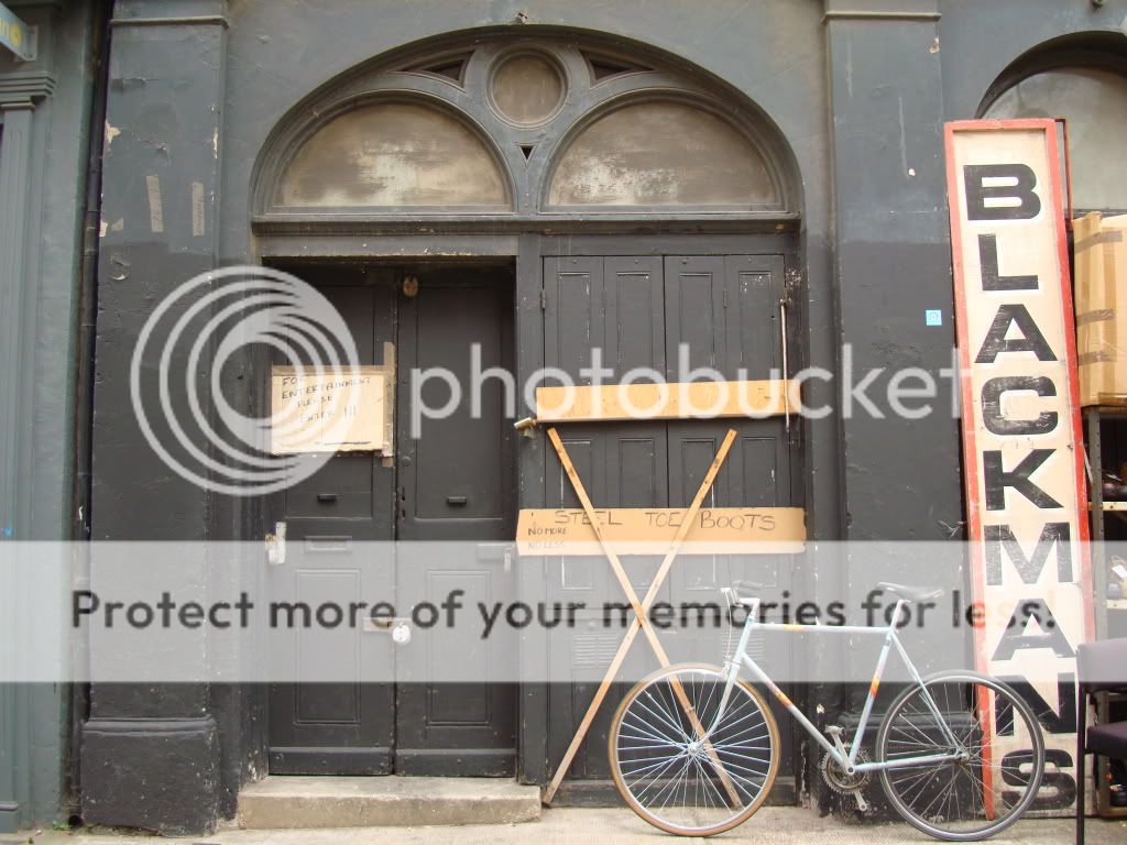
Metal rails hidden in bare brick nooks proffered patched-up french cavalry uniforms and Edwardian nightdresses. A faded british flag poked out from a plumage of ostrich feathers and Dickensian top hats. Three battered helmets sat atop an old radiator, and while I peered through one of the racks I was entirely surprised by the fact that behind the clothes there was yet another hidden room, almost entirely in darkness yet I could make out a torn chaise lounge covered in a victorian ball gown and an indeterminate number of muddy army boots.

A lamp constructed out of a Hells Angels prosthetic leg.


So often these concept stores come across too contrived, too insincere or too precious. A Child of the Jago was none of these things. The store had an amazing atmosphere but also had the goods to back it up (legitimate antiques rather than the junk which passes for vintage these days) which makes all the difference in terms of authenticity. I know some John Galliano disciples who would die to see this so if you're lucky enough to live in London, go visit it now, and if not do the next best thing and check out the website.

Wednesday, July 21, 2010

East London Scene


Amazing colours and I loved the fact that the sign says "STEEL TOE BOOTS. No More. No Less."

Friday, July 16, 2010

What Would Martin Margiela Do?


This is a question I sometimes like to ask myself if I come across a particularly difficult design problem. The answer is always, undoubtably, "something amazing".

I was lucky enough to visit to the Maison Martin Margiela '20' exhibition in Somerset House a couple of weeks ago. As an exhibition I was really struck at how it completely and utterly reflected the foundations of the brand. It was organised around sections devoted to trompe l'oeil, paint, destruction, silhouette and re-invention, all of which are signature design tools of the house. However, these elements also controlled the way the pieces were exhibited- canvas sheets with large empty hallways printed on them provided a doorway for visitors, who walked through to the see the real hallway and the exhibits. Another room was strewn with white confetti and large furniture draped in white cotton which faced three walls covered in television screens, all different sizes, shapes and from different eras. In the middle of the next room are some leftover bags of confetti.

The most fashionable caravan I've ever seen.

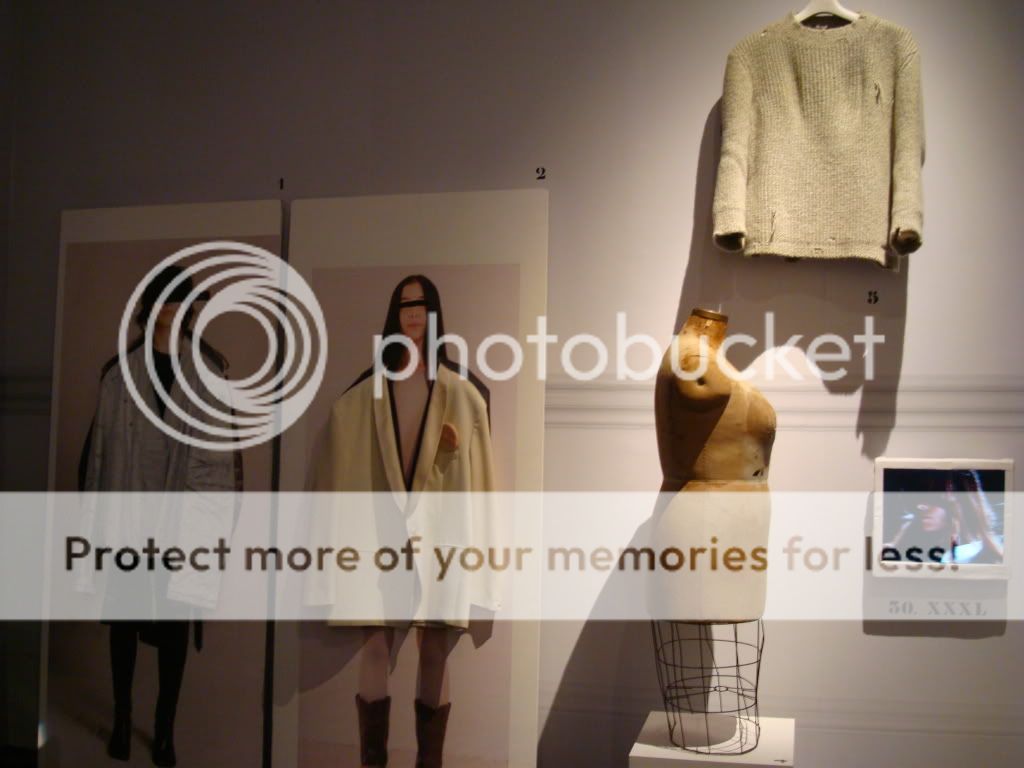
Garments from the XXXL collection, including the mannequin used in their development.

XXXL Accessories.

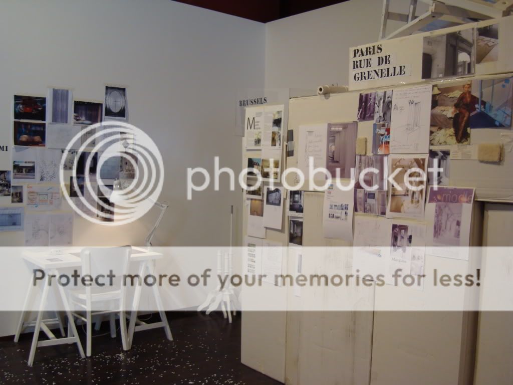
Plans for the development of each Margiela store- paint chips, interior sketches and notes.


It comes across as a mis-matched celebration of imperfection which Margiela has become known for. Just as Margiela rejects the impenetrability of the "fashion house" and brings the construction and flaws of a garment to the fore, the exhibition is self-referencing (there is a life-size foam cut-out of everyone involved in it's creation) and highlights the behind-the-scenes of the house. So instead of it being an exhibition about Maison Martin Margiela, you get the feeling that they've constructed a part of the Maison in London and we're just allowed to wander through it for a while. Which is exactly how it should be.

Tuesday, July 13, 2010

Taking Inventory

While in London I was fortunate enough to meet two of the guys behind the amazing Inventory magazine. Word on the street is Rei Kawakubo herself has it express posted to her as soon as it's released. Not bad after only two issues.

Inventory has an extremely focused aesthetic which is perhaps why they've found such a cult following so quickly. Mix classic, relaxed menswear with quirky streetstyle sensibilities and watch the magic happen. Flicking through the online features I also found this piece on the new collection for Japanese brand Visvim (see below), which a friend told me about recently (what did I say a few weeks ago? No man is an island indeed...). Read about it here. All images by Ryan Willms of Inventory.


The magazine itself is available through Incu in Sydney and Melbourne, or check out the website.

Monday, July 12, 2010

Ahem... Excuse Me...

...for my absence these past few weeks. I was lucky enough to be set loose in London and was rather too busy enjoying everything that amazing city has to offer to find time to sit myself in front of a computer. That said, I have now discovered a whole load more inspiration to share so stay tuned!

Being London, creativity turned up in the most unexpected places, such as this Strawberry Shortcake wallpaper lining the bathroom walls in The Breakfast Club cafe in Hoxton. Love it!

Wednesday, June 9, 2010

Wonderwood

My apologies for harping on about Comme Des Garcons, it's hard not to, but I just came across this short film by the Quay brothers which coincides with the release of the new CDC fragrance Wonderwood. The creepy puppet voyeurism is oddly mesmerising and disconcerting. I'm not sure if I like it but it does make me want to see what the fragrance smells like- if only to see what would inspire a film like this-so I suppose it works.

Friday, June 4, 2010

Dress Becomes Body

I recently posted about a Pierre Huyghe exhibition which questioned the boundaries and limitations we place on on space and objects. This got me to thinking about the concept behind Commes des Garcons' infamous S/S 1997 collection- often referred to as the "lumps and bumps" collection. My tutor advised me to check out the range after seeing some of my own somewhat "lumpy" designs and I think it's absolutely amazing.

Rei Kawakubo's philosophy for the range was Body meets Dress. Dress meets Body. Dress becomes Body. This questions the threshold between dress and our bodies- each one shapes the other so how is it possible to differentiate them? (image below from Caroline Evans, 2003, Fashion at the Edge: Spectacle, Modernity and Deathliness, Yale University Press, New Haven, p268)


(bottom two images from http://fagcity.blogspot.com/2009/10/lumps-and-bumps.html)

Friday, May 28, 2010

No Man is an Island

Time and time again we have been told by our tutors that you can't design in a vacuum. This year, more than ever, I have become aware of how true this is and how my designs are influenced by the world around me. My collection is shaping up to be quite masculine, and my good friend from Design Brain Bucket is actually designing menswear, so I've been thinking a lot more about what's going on in the world of men's fashion. Another friend posted on The View From Here an image from Lookbook.nu, which lead me to a site I didn't even know existed and down another rabbit hole to discover these quite beautiful, dandy-esque menswear photos by Francois Bouret.


images from lookbook.nu

This is a good opportunity for me to indulge in design with a completely different aesthetic to what I'm working on. It also shows me how important it is to keep sharing inspiration, you never know where it may lead...

Monday, May 24, 2010

Underwater Colour

Whilst trawling It's Nice That I came across a feature on Jill Greenberg's Underwater series. She's tagged "The Manipulator" because of her digitally enhanced photography which verges on surrealism. I didn't realise it but I actually knew a lot of her work- the crying children in End Times and the countless advertisments, fashion editorials and celebrity portraiture which always has an unsettling, if not sinister quality. However, Underwater is new to me and I think it piqued my interest because of the amazing colours (electric blue anyone?) and that the whole idea is layer upon layer of artificially enhanced nature. The pool is a man-made body of water, reflecting unnatural colours, and the subjects are manipulated and their movements stylised to an extreme.


(these images from Ambient Art Gallery)


(these images from photoshelter)


If these models look surprisingly co-ordinated it's becuase they are actually members of the American Olympic synchronised swimming team. To see more of her work, have a look at her online portfolio at Manipulator.com.

Wednesday, May 19, 2010

The Light Fantastic

I was looking up artists who use electricity and light in their works when I came across Pierre Huyghe. He's a french artist who explores some pretty complex ideas through a range of mediums, from video and digital graphics to photography and installation. A 2006 exhibition called Celebration Park was entirely white, with moving doors and words spelled out in fluorescent white light. He was playing with the ideas of a door being a threshold, by constantly changing their position within the space the "inside" and "outside" ceased to exist. (all images from PBS)


The Journey That Wasn't is a film by Huyghe based on going to Antarctica to search for a mythical albino penguin. It's about mental, physical and philosophical journeys. Did he really go to Antarctica with a group of artists and get stuck in the ice? or it is staged? It doesn't matter because the point is questioning, learning and creating.


Finally, this is one of my favourite stills from his films because it is serene and completely odd at the same time. Huyghe found a town under construction near New York, to be called Streamside. Everyone there came from somewhere else and there was no history to the town yet. So he organised "Streamside Day", complete with parades and speeches, creating a hyper-reality based on fact but a complete work of fiction.


It's pretty difficult to try and summarise his work into one post- so if you're interested in these ideas have a look at the Art 21 site, they have a decent bio and slideshows of his work with more in-depth explanations.

Monday, May 17, 2010

Electric Colour

There's a lot of talk about colour going on around the fashion halls at the moment. I've been a part of in-depth discussions about the virtues of cold greys with steel blue influences versus warm greys with a tint of mouse brown but without heading over to taupe. Skin comes in colours from nude, flesh, beige, powder pink to peach-but-not-peach, and my own variation "burnt flesh".

So I have colour on the brain. At the moment I just can't get over neon blue. Developing the colour palette for my final collection I started looking at the colours of electricity, neon hues of all sorts but particularly blue. This came from a recent obsession with Blade Runner (apologies to anyone who studied it for year 12-I only discovered it last year and so it hasn't been ruined). The movie showcases neon lights in all their glory. Contrasted with the derelict surroundings I found it a really powerful element in the film. That and blue smoke.

(image from Original Trilogy)


(image from Broken Projector)

There is just something so amazing about this almost turquoise, electric sea colour that makes it jump off the screen. However not so easy to concoct in a dye pot. One last electric delight is a restored neon umbrella prop from the Blade Runner, which I didn't even notice during the film but I think it's fairly amazing- partly due to the prop itself and partly because of this eerie photo.

(image from Blade Zone)

Tuesday, May 11, 2010

2 For 1: Deer Cape

In my internet travels today I stumbled upon this cape which is quite possibly the best thing I've ever seen. I had to put it up straight away, so I know very little about the designer Christophe Coppens- except the fact that he is Belgian (of course!). It was part of the "Art of Fashion: Installing Allusions" exhibition at the Museum Boijmans Van Beuningen, Rotterdam along with experimental works by Viktor & Rolf, Commes des Garcons, Hussein Chalayan and Walter Van Beirendonck to name a few. (images from we make money not art)


The thing that got me about this cape is that I feel waves of emotion towards it. One the one hand, I think it is hilarious and amazing because well, I've just never seen anything like it before. Who would think of a cape that is shaped like a deer? Genius! But then I started thinking, what if other people just look at it and think it's just another ridiculous fashion indulgence because nobody would wear it? But why wouldn't anyone wear it? Why do designers have to tone down their "show pieces" for retail? If it still keeps you warm and you can move in it then what difference does it make if its plain black wool or checked and shaped like a deer? Then of course I start thinking that there is a lot of ridiculous fashion that I find disgusting, so maybe it's just personal taste. This is something I'm struggling with at the moment, finding the balance between beautiful avant-garde design and scary wearable art. I guess when it comes down to it I love this cape and I would wear it simply for the fact that it would make me laugh all day, and if fashion can't make you laugh then what can?

One last thing... a bit more digging found this image of songstress Roisin Murphy wearing the cape during a performance, and I think she looks pretty amazing. (image from sound bites)

Sunday, May 9, 2010

Total Art Total Colour

EE [Total Art] are a Korean electro duo with high octane, club-catchy beats. Whether you love or loathe techno their lo-fi, psychedelic eighties film clips are a sight to behold. Bowie-style makeup, glittering costumes, fireworks, rainbow lighting and some old school post-production are the gaudy eighties at their best- which isn't saying much I know, but the lack of studio polish is refreshing. This, coupled with high energy and passion, produces a highly entertaining clip with a bit more soul than the usual MTV perfection. (clip from youtube)

Saturday, May 8, 2010

Kids Get Colourful

With the exception of a few designers, this Autralian Fashion Week was decidedly lacking in colour. I'm not sure if it's a reaction to the GFC or if everyone just decided to jump on the Phoebe Philo/Celine bandwagon and go for the neutral simplicity which has been making waves of late- either way there was a definite trend towards beige, camel and pale grey. With that in mind, here are some of the more colourful highlights of RAFW 10/11. (all images from Vogue.com except Marni Skillings pic from Harpers Bazaar)


Both images: Romance Was Born


Fernando Frisoni

Marni Skillings


Camilla and Marc


Kirrily Johnston


Dion Lee

Friday, May 7, 2010

Starry Eyed at Ellery

Fashion Week strikes again with this amazing Zodiac-inspired collection from Ellery. From the very first look's insane ripped bell-bottoms and shimmering beads I knew this was going to be a standout range. Silver foiling and heavy beading (which I am usually vehemently opposed to) adorned the garments, turning the models into a shimmering sci-fi dream. They appeared through the rising smoke as if emerging from some post-apocalypic wasteland. I particularly loved the grey and blue tonal palette as the black pieces didn't give that "wow" effect on the catwalk. The cut-out jackets, double-looped belts and layering pieces show that underneath the extensive styling there are actually some amazing, wearable pieces- which is more than I can say for some designers. (all images from Vogue.com)


Tuesday, May 4, 2010

Camilla and Marc S/S 2010-11

The second day of Australian Fashion Week kicked off with a stunning show from Camilla and Marc. Set in a dimly lit, moody interior, this season the designers took us around the world with a exotic looks perfect for the glamorous nomad.


(images from Zimbio)

Their signature elements such as soft tailoring and beautiful frocks were a strong presence in the collection, however overall it signalled a definite shift towards colour and print. Cobalt blue, lemon and tangerine lit up the elegant palette of khaki, earthy greys and subdued pink. The tortoiseshell and sandstorm prints were perfect on draped georgette dresses, with one of my favourite looks working a featherweight safari-style shirt and baggy khaki leather pants.


(images from Zimbio)

Ethnic influences came through heavily in the accessories, which are so beautiful my only problem is deciding on the pieces I love the most. Rows and rows of layered chain jewellery adorned the model's arms, and continued to some amazing earrings which moulded around the back of the ear. The gold, rhino-head rings and luxurious leather turbans which topped some looks were absolute standouts and perfect for the exotic traveller.


(images from Vogue.com)

See the whole collection and backstage photos at Vogue.com.